LinkedIn Banner: How to Create a Great One in 2026
Your LinkedIn profile photo takes up a small circle. Your banner takes up everything behind it. Yet most profiles still run the default gray background, or a stock gradient that says nothing. That is prime real estate, seen by every single visitor, left completely empty.
For a salesperson, a founder, or a freelancer, that gap is expensive. A prospect who checks your profile before replying to your message forms an opinion in seconds. A blank or blurry banner sends the wrong one.
This guide covers it all: what a LinkedIn banner is, what it actually does, how to create one without being a designer, 10 banner ideas by role, the best practices for 2026, and the mistakes that quietly kill the effect you are after.
What is a LinkedIn banner?
A LinkedIn banner, also called a LinkedIn background photo or cover photo, is the wide horizontal image that sits at the top of your profile or company page. It acts as the backdrop to your profile picture and headline.
In plain terms, it is the first large visual a visitor sees. On a personal profile, it frames your identity. On a company page, it carries the brand. Either way, it is a free advertising slot LinkedIn hands you, and one you control completely.
Do not confuse it with your profile photo (the round image, your face) or with a featured post image. The banner is the big rectangle in the background.
Personal profile banner vs company page banner
The two serve different purposes, and it is worth separating them right away.
| Criteria | Personal profile | Company page |
|---|---|---|
| Goal | Credibility, personal branding, sales message | Brand awareness, hiring, product |
| Tone | Human, personal, sometimes direct | Institutional, on-brand |
| Typical content | Value proposition, expertise, social proof | Logo, tagline, current campaign |
| Update cadence | With your news or target audience | With marketing campaigns |
The rest of this guide focuses mostly on the personal profile banner, because that is the one that matters most for social selling and prospecting. But most principles apply to a company page too.
What is a LinkedIn banner for?
A good banner is not decoration. It is a tool. Here are the four jobs it does.
1. It builds credibility. A polished profile with a coherent banner signals professionalism. A default background suggests an abandoned or careless account. That judgment is unfair, but it is real, and it forms in under five seconds.
2. It supports your personal branding. The banner says who you are at a glance: your role, your specialty, what sets you apart. It is the visual version of your headline.
3. It delivers a sales message. You can place a clear value proposition there (“I help industrial SMBs build a reliable sales pipeline”), a piece of social proof, or a call to action. Visitors read that message without you having to write to them.
4. It powers your social selling. When you prospect on LinkedIn, your targets check your profile before deciding whether to reply. A banner that clearly states the value you bring increases the odds of a positive response. More on that below.
See how Zeliq complements your LinkedIn profile
A sharp banner pulls the right prospect onto your profile. But you still need to reach them afterward. Zeliq finds the verified email and direct number of your targets, then lets you run multichannel sequences from a single platform. Book a demo to see the full workflow.
What are the right LinkedIn banner dimensions?
Dimensions are not the focus of this guide, but here is what you need to avoid a mistake.
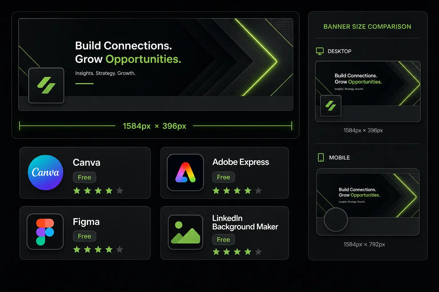
For a personal profile, the recommended size is 1584 x 396 pixels, a 4:1 ratio. For a company page, use 1128 x 191 pixels. LinkedIn accepts JPG and PNG files, up to 8 MB.
The classic trap: LinkedIn crops the banner differently on desktop and mobile, and your profile photo overlaps the bottom-left corner. So keep the important elements (text, logo) centered and well away from the edges.
If you want the exact safe zones and crop behavior, that deserves its own breakdown. Here, we focus on content and message: the part most profiles get wrong.
How to create a LinkedIn banner
Good news: you need neither Photoshop nor a designer. Several free or low-cost tools do the job in minutes.
Tools to create a free LinkedIn banner
Canva. The simplest option. Canva offers hundreds of LinkedIn banner templates already sized correctly. Search “LinkedIn banner”, pick a template, swap the text and colors. The free plan is more than enough.
Adobe Express. A Canva equivalent, with a template library and an online editor. Handy if you already work inside the Adobe ecosystem.
Figma. More technical, but ideal if you want full control and a pixel-perfect result. Worth it if you have design basics or follow a strict brand guideline.
Free templates. Many sites offer downloadable LinkedIn banner templates. Useful as a starting point, as long as you customize them so you do not look like a thousand other profiles.
The steps to a strong banner
- Define your message. Before opening any tool, write in one sentence what the visitor should remember. Without a clear message, even the prettiest design is useless.
- Pick the right format. Start from a 1584 x 396 px canvas for a personal profile.
- Keep elements in the safe zone. Text and logo centered, nothing important in the corners.
- Stay simple. One or two colors, a readable font, a single main message.
- Test on mobile. More than half of LinkedIn traffic is mobile. Make sure the text stays legible on a small screen.
- Export as JPG or PNG and upload it from your profile, using the pencil icon at the top right of the banner area.
The anatomy of a good LinkedIn banner
What makes a banner work? Five elements, applied together.
The safe zone. As noted above, the edges get cropped and the bottom-left corner is hidden by the profile photo. Anything that matters has to sit in the center.
Mobile readability. Text that reads fine at 14 px on desktop can become unreadable on a phone. Choose a generous font size and strong contrast between text and background.
A clear, single message. The visitor should grasp the idea in two seconds. One sentence, not a paragraph. One promise, not a service list.
A visual CTA (optional but powerful). You can add a subtle call to action: “Let’s talk”, a website address, a QR code. Note that LinkedIn does not make the banner clickable, so the CTA is purely visual and suggestive.
Brand consistency. Colors, font, and tone should match your profile photo, your headline, and, if you represent a company, its brand guidelines. A coherent profile earns more trust.
Should you put text on your LinkedIn banner?
Yes, in most cases. A purely decorative banner is pretty but mute. A banner with a clear sentence delivers a message to every visitor, with no effort from you. The rule: short text (five to ten words), centered, highly legible. If your work is very visual (photographer, designer), a strong image can carry it, but that is the exception.
10 LinkedIn banner ideas and examples by role
The best banner depends on your role and your goal. Here are ten concrete directions, grouped by profile.
For a salesperson or SDR
- The customer-focused value proposition. “I help SaaS companies fill their reps’ calendars.” The prospect immediately understands what you do for them.
- Social proof. A banner showing a striking metric or a recognizable client logo (with permission). Credibility before pitch.
- The outcome-driven banner. A sentence centered on the benefit: “More qualified meetings, less time lost to prospecting.”
For a founder or executive
- The company vision. A tagline that captures the mission: what you change in your market.
- The product banner. A simple visual of your product or interface, with a short hook.
- The growth milestone banner. Announce a funding round, a launch, an expansion. Useful when your news is itself an argument.
For a freelancer or consultant
- Expertise in one line. “Growth consultant, I help B2B startups structure their acquisition.” Clear, specific, no filler jargon.
- The visual portfolio. For creative roles, a sample of your work in the background beats any words.
For a recruiter
- The employer brand banner. Highlight company culture, open roles, or a reason to join. Your candidates will see it before replying to your message.
For any content-driven profile
- The topic banner. If you post regularly on a specific subject, say so: “I share B2B prospecting and social selling tips every week.” You turn visitors into followers.
What every example shares: one message, one audience, one benefit. Avoid the catch-all banner that tries to say everything.
LinkedIn banner best practices for 2026
LinkedIn keeps evolving, and a few principles are worth restating to stay relevant this year.
Design mobile-first. Most profile views happen on a phone. A banner built only for the desktop screen will be poorly cropped. Design and test the mobile version first.
Keep it minimal. The trend is toward simplicity: a solid background or a light gradient, a short message, plenty of white space. Banners crowded with icons and text look dated.
Align banner and headline. Your banner and your headline should tell the same story. If the banner says one thing and the headline another, the visitor is lost.
Update it regularly. A banner that mentions a past event or an expired offer hurts your image. Treat it as a living asset, refreshed with your news.
Match it to your profile photo. The two images sit side by side. A professional photo with a sloppy banner (or the reverse) creates dissonance.
Common mistakes to avoid
These are the errors that show up most often and undercut a banner’s effect.
Keeping the default background. Mistake number one. The standard gray banner signals an inactive profile. A waste for such a visible space.
Text cropped on mobile. You place a perfectly readable sentence on desktop, but on a phone it gets cut off or hidden behind the profile photo. Always test both screens.
Visual overload. Three messages, five icons, two logos, a QR code, and a photo: the visitor does not know where to look. An effective banner makes one choice.
A blurry or pixelated image. A banner exported at low resolution or in the wrong ratio looks fuzzy. Respect the 1584 x 396 px format and export at high quality.
Letting it go stale. A banner that says “Webinar on March 12” when it is May suggests a neglected profile.
No message at all. A pretty landscape photo, with no hint of your role or value, is a missed opportunity. Aesthetics alone do not convert.
Using your LinkedIn banner for B2B prospecting
This is where the banner becomes a real sales lever, not just a cosmetic touch.
The banner as a silent first touchpoint
When you send a prospecting message on LinkedIn, your target almost always does the same thing before replying: they click your profile. At that exact moment, your banner speaks for you.
If your banner clearly states the value you bring to people like them, you have already answered the question “why should I listen to this person?”. The message you sent becomes credible. A blank banner, on the other hand, forces the prospect to give you the benefit of the doubt, which they rarely do.
Aligning the banner with your audience
For social selling, the best banner is not the one that talks about you, but the one that talks to your prospect. Frame your message from your target’s point of view: their industry, their problem, the outcome they want. “I help industrial sales leaders build a reliable pipeline” works better than “Sales solutions expert with 10 years of experience.”
The banner inside a complete prospecting setup
A good banner improves your reply rate, but it is only one piece of the puzzle. An effective prospecting motion combines:
- A polished LinkedIn profile, banner included, that earns trust.
- A precise target: the right decision-makers, at the right companies.
- Reliable contact details to follow up beyond LinkedIn.
- A coordinated sequence of touches across several channels.
That is where a tool like Zeliq comes in for the last three points. Its B2B lead database helps you identify the decision-makers who match your target, exactly the audience your banner is built to attract. Its browser extension adds a prospect spotted on LinkedIn in one click, with verified contact details. And multichannel prospecting chains email, social messages, and calls into one coherent sequence.
In short: the banner attracts and reassures, the prospecting tool finds and engages. The two work together.
For a salesperson or business developer
If you are a business developer, your banner has a precise job: reassure the prospect at the moment they check who you are. A clear, outcome-focused value proposition is enough. No need to overdo it. The rest plays out in the quality of your targeting and your messaging.
For a sales leader
A sales leader has a double interest: their own banner, but also the team’s. Encouraging every rep to polish their LinkedIn profile, banner included, lifts the reply rate of the whole team in prospecting. It is a free optimization, often overlooked, worth building into onboarding.
Take action
The LinkedIn banner is one of the few communication spaces fully under your control, seen by every visitor to your profile. Leaving it blank means giving up a free advantage.
Concrete step for today: open Canva, pick a LinkedIn banner template, write in one sentence the value you bring to your audience, and publish. Fifteen minutes is enough to turn an anonymous profile into one that works for you.
Turn your LinkedIn profile into a lead machine
Zeliq finds, enriches and engages B2B prospects from one platform. Account created in 2 minutes, no credit card.
Book a demoOnce your banner is live, the real work begins: finding the right people for your profile to speak to, and engaging them at the right moment. That is where prospecting takes over, and where every profile visit can turn into a conversation.