
LinkedIn Banner: Size Guide, Design Tips and SDR Playbook (2026)
Your LinkedIn profile is the first thing a prospect checks before accepting your connection request or replying to your outreach. Within three seconds they have formed an opinion about whether you look credible enough to engage with. The banner is the largest visual surface on that profile, and most people leave it as the default grey rectangle LinkedIn provides.
This guide covers what you need to make that space work: the exact 2026 dimensions, the safe zones that trip up even experienced designers, what to put on your banner, how to build one for free in under 30 minutes, and a specific playbook for SDRs and Business Developers who rely on LinkedIn as a prospecting channel.
TL;DR: Key Takeaways
- The LinkedIn personal profile banner is 1584 x 396 pixels, aspect ratio 4:1, max file size 8 MB.
- Keep all critical elements (text, logo, CTA) inside a central 1350 x 220 px safe zone to avoid mobile crop.
- Your photo thumbnail sits in the bottom-left corner and overlaps the banner: leave the bottom-left ~180 px clear of important content.
- Canva, Adobe Express and Microsoft Designer all offer free templates at the right dimensions.
- For outbound sales, your banner is not decoration. It is the first signal of credibility a prospect evaluates before deciding whether to respond.
- One banner format does not fit all: choose between the employer brand approach, the value proposition approach, or the social proof approach based on your current priority.
What Is a LinkedIn Banner?
The LinkedIn banner (also called a background photo, cover image, or cover photo) is the wide rectangular image that sits at the top of your LinkedIn profile, behind your circular profile photo. It spans the full width of the profile card and is the single largest visual element on your page.
Where exactly does it sit?
On desktop, the banner fills the top section of your profile from edge to edge, with your profile picture positioned in the lower-left corner overlapping the bottom of the banner. On mobile, the rendering changes: the banner is cropped on both sides and the visible height is reduced. If you have ever updated a banner and then noticed that your tagline had disappeared on your phone, this is why.
Personal profile versus company page: what is the difference?
The two formats use different dimensions and different aspect ratios:
| Format | Recommended size | Max file size | Accepted formats |
|---|---|---|---|
| Personal profile | 1584 x 396 px | 8 MB | JPEG, PNG, GIF |
| Company page | 1128 x 191 px | 4 MB | JPEG, PNG, GIF |
| Career page | 1128 x 376 px | 4 MB | JPEG, PNG, GIF |
Do not reuse a personal banner on a company page without resizing. The proportions are different enough that content will be cut or distorted.
Why does the banner matter at all?
Most LinkedIn profiles share the same structure: name, title, location, a few hundred connections. The banner is the one element where you have complete creative control and the most screen real estate. It works on three levels. First, it creates a visual first impression before the visitor reads a single word. Second, it positions your professional identity: your sector, your role, your company, or your value proposition. Third, it signals how seriously you take your own profile, which is a proxy for how seriously you take your work.
For passive profile visitors, the banner is often the deciding factor in whether they keep reading or bounce.
LinkedIn Banner Size and Dimensions in 2026
Exact dimensions
The official recommended size for a LinkedIn personal profile banner in 2026 is 1584 x 396 pixels. This has been stable for several years. LinkedIn accepts JPEG, PNG and GIF files up to 8 MB. For company pages, the recommended size is 1128 x 191 pixels at up to 4 MB.
If you upload an image with different proportions, LinkedIn will ask you to crop it manually before saving. This is where many users accidentally cut off a logo or a key line of text. Always start from the correct canvas size in your design tool to avoid this step entirely.
Resolution: what you actually need
Work at 72 dpi. That is the standard for screen display, and it is all LinkedIn renders. There is no benefit to exporting at 300 dpi (a print standard): the file will be heavier without any visible improvement. Both Canva and Adobe Express export at screen resolution by default, so you do not need to adjust this manually.
Safe zones: the detail most guides skip
This is where most banner mistakes happen. LinkedIn does not display your banner identically across all devices and screen sizes. Two specific constraints apply:
The mobile crop. On mobile, LinkedIn renders approximately 1200 px of the 1584 px width, meaning roughly 190 px on each side can be cropped. Any text or graphic element sitting in those outer margins may be invisible to anyone viewing your profile on a phone.
The profile photo overlap. Your circular profile picture sits in the lower-left corner of the banner. It covers roughly the bottom-left 180 px of the banner area. Place anything important there and it will be hidden behind your own photo.
The practical rule: keep all text, logos and key visual elements inside a central zone of approximately 1350 x 220 pixels, centered both horizontally and vertically on the full 1584 x 396 px canvas. Use the outer margins for background color, pattern or texture that looks fine when cropped.
One more habit worth building: after uploading any banner, open your LinkedIn profile on your phone immediately and check that nothing critical has been cropped or overlapped. Desktop previews in design tools do not simulate the mobile crop accurately.
Does LinkedIn change banner specs?
LinkedIn’s interface updates regularly. The 1584 x 396 px spec has remained consistent for years, but how the banner renders on newer devices (notched screens, high-density displays) can shift. Check your banner on mobile after every significant LinkedIn interface update, not just after you change the image.
What to Put on Your LinkedIn Banner
Match content to objective
There is no single correct approach to banner content. What works depends on what you are trying to achieve on LinkedIn:
Generating inbound leads (freelancer, consultant, sales rep): your banner should answer one implicit question that every profile visitor asks: “What does this person do and for whom?” A short tagline, your area of specialization, or the specific outcome you deliver for clients. Five to eight words, maximum. Pair it with a clean background in your brand colors.
Representing a company: use the official company banner if one exists. A consistent visual identity across all employee profiles builds trust with prospects who notice the uniformity. If you are an SDR at a well-known SaaS company and your profile looks aligned with the brand, you signal institutional credibility before you have said a word.
Job seeking: the default grey banner actively signals an unmaintained profile. Replace it with something that evokes your sector or your skillset. A clean, professional visual that references your area of expertise is enough.
Building a content audience: some creators display their content theme, publishing cadence, or editorial line on the banner. This works well if you post consistently and want new followers to understand immediately what they are subscribing to.
Elements that work
- A solid background in your brand or company colors
- A short, specific tagline (not a generic slogan)
- Your logo or your company’s logo, placed within the safe zone
- Simple graphic elements that suggest your industry without cluttering the composition
- Contact details (website, email) if you are actively seeking inbound, positioned in the central safe zone where they remain visible on mobile
Mistakes to avoid
Overloading the design. Too much text, too many logos, too many graphic layers. The visitor’s eye has nowhere to go. If you cannot explain what your banner communicates in one sentence, it is too complex.
Placing key elements outside the safe zone. This is the most common technical error. Test on mobile before considering the banner done.
Ignoring the profile photo overlap. A common result: a beautifully designed banner with the tagline or logo sitting directly behind the profile picture. On desktop you see it. On mobile you see half of it.
Using the default grey background. In competitive sectors like B2B tech and SaaS sales, a default banner signals a low-effort profile. In a prospect’s mind, it creates a small but real association: if this person does not invest in their own credibility signals, will they invest in mine?
Using a low-resolution image. A pixelated or blurry banner undermines everything else on your profile. LinkedIn displays banners at full width on desktop. A low-resolution image is immediately obvious.
Using a personal holiday photo. Unrelated visuals confuse profile visitors and create a mismatch between what your headline says you do and what your profile looks like.
Should you add contact details to the banner?
It depends on context. LinkedIn already provides contact buttons and a website field in the profile info section, so your banner does not need to duplicate this. However, if you are in active business development mode and want to reduce friction for inbound contact, displaying a website URL or an email can help. If you do, place it clearly inside the safe zone and ensure the text is large enough to read on a phone screen without zooming.
How to Create a LinkedIn Banner for Free
Three tools that cover most use cases
Canva is the standard choice. It has hundreds of LinkedIn banner templates at exactly 1584 x 396 px, a drag-and-drop editor, a large library of free fonts and images, and a free tier that is more than sufficient for a professional result. Search “LinkedIn banner” in Canva’s search bar and you will get dozens of ready-to-customize templates. Export as PNG for designs with text or sharp graphics, JPEG for photo-based backgrounds.
Adobe Express (formerly Adobe Spark) offers similar functionality with templates that tend toward a more polished brand aesthetic. The free tier is functional, though some premium elements require a subscription. If you already use Adobe products, Express integrates cleanly with your existing brand assets.
Microsoft Designer is newer and free with a Microsoft account. It incorporates AI generation, which is useful if you want to create a custom background from a text prompt rather than modifying a template. The results are variable, but for a solid abstract or geometric background it can save significant time.
Step-by-step: building your banner in Canva
- Open Canva and click “Create a design.” In the search bar, type “LinkedIn banner.” Canva will propose a canvas at 1584 x 396 px automatically.
- Browse templates or start from a blank canvas with a solid background color.
- Set the background to your brand or company colors. If you do not have brand guidelines, choose a single dark or mid-tone color that contrasts well with white text.
- Add your text. Keep it to one line if possible. Position it inside the central safe zone: stay at least 120 px from each side edge and 80 px from the top and bottom edges.
- Add your logo in the upper-right or upper-center area, within the safe zone.
- Preview at a reduced zoom level to simulate how the design looks at smaller sizes. If text is hard to read at 50% zoom, it will be hard to read on mobile.
- Export as PNG (preferred for sharp text) or JPEG.
- On LinkedIn, go to your profile, hover over the banner area and click the pencil icon or “Edit.” Upload your file. LinkedIn may show a repositioning interface: use it to confirm the image is centered as you intended. Save.
- Immediately open your profile on your phone and verify the safe zone rule held.
When to hire a designer
Free tools cover the vast majority of needs. A designer is worth the investment if you have a detailed brand identity to implement precisely, your banner is part of a broader visual kit (company page, team profiles), or your sector has high visual standards where generic templates look out of place.
LinkedIn Banner for SDRs and Business Developers: The Outbound Prospecting Angle
Why your banner is a prospecting tool
When you send a LinkedIn connection request or a cold message, the first thing most prospects do is click your profile. They spend a few seconds deciding whether you look worth responding to. In those seconds, they see three things: your profile photo, your headline, and your banner. That is the full first impression you get.
In B2B outreach, where a prospect may receive 20 to 50 LinkedIn messages per week, every credibility signal matters. An optimized banner does not guarantee a reply, but a generic or empty banner actively creates doubt. The implicit reasoning on the prospect’s side: “If this person has not bothered to set up their own profile, why would I trust them with my time?”
Conversely, a clean, brand-aligned banner with a specific value proposition creates a positive prior to your message being read. It says: this person is organized, represents a real company, and has thought about who they are talking to.
Three banner approaches that work for sales reps
Approach 1: Employer brand alignment. Use the official company banner that your marketing team has designed. This is the fastest solution and the most consistent: every prospect who has seen your company’s content or ads will recognize the visual language. It also positions you clearly as a representative of an institution rather than a lone individual, which matters in enterprise sales.
Approach 2: Personalized value proposition. Write a short message targeted directly at your ICP. Something like: “Helping SaaS sales teams build pipeline faster with outbound that actually converts.” This is higher-risk and higher-reward: if the message resonates with the specific prospect, it creates an immediate connection. If it is generic, it reads as hollow. Make the benefit specific to a job title or industry segment, not just “sales.”
Approach 3: Social proof. Display logos of clients or recognizable partners, badges from review platforms, or a short testimonial. This works well when your company works with well-known brands in your target vertical. One recognizable logo in the right context can do more work than three paragraphs of outreach copy.
Aligning the banner with the full profile
The banner is one element in a coherent profile system. For an outbound-focused SDR, every layer needs to pull in the same direction:
Headline. Move beyond “SDR at [Company].” A better formula: “Helping [target persona] achieve [specific outcome] | [Role] at [Company].” It speaks to the prospect’s world, not yours.
About section. This is your landing page copy. Answer in three to five lines the question your prospect is silently asking: “Why should I talk to this person?” Lead with the problem you solve, not your career history.
Featured section. Surface something useful for your target: a case study, a short video, or a blog post that speaks to a recognized pain point. It extends your credibility beyond the header card.
Activity. Posting consistently in your ICP’s area of interest builds visibility over time. SDRs who publish practical content for their target audience book more meetings from the same volume of outreach because their profile feels like a resource, not just a pitch.
Connecting LinkedIn profile optimization to outbound with Zeliq
A polished LinkedIn profile gets more prospect visits to land. The next step is knowing exactly who to target, how to reach them and how to follow up across channels without losing track. Zeliq centralizes the whole outbound workflow: find prospects in a database of 450M+ verified B2B contacts, enrich their contact details automatically, then engage them through coordinated email, LinkedIn and phone sequences, all from one interface. No tab-switching, no manual re-entry.
Building the outbound loop: from banner to booked meeting
Here is how the banner fits into a broader LinkedIn prospecting workflow for SDRs:
Step 1: Optimize the profile (banner included). Before any outreach, your profile needs to hold up to scrutiny. A prospect who receives your message and visits your profile should leave with more confidence, not less.
Step 2: Identify the right prospects. Sending connection requests at volume to badly segmented lists is the fastest way to burn your reputation and hit LinkedIn’s limits. Use filters to target by role, company size, industry, and geography. Zeliq’s B2B lead database lets you apply these filters across 450M+ contacts before you even open LinkedIn, so your connection request queue is filled with actual ICP matches.
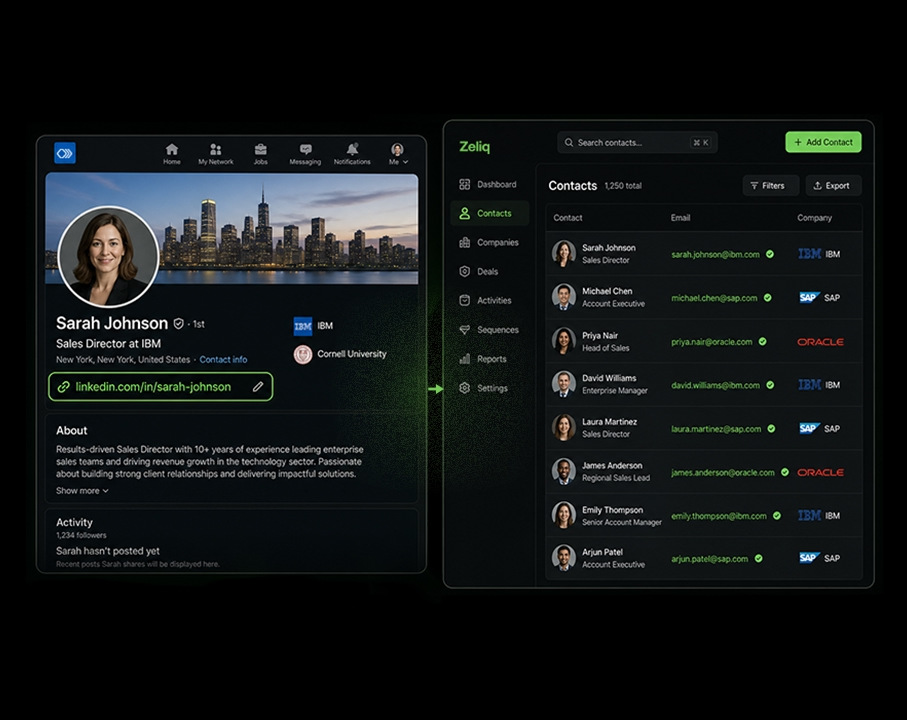
Step 3: Use the browser extension to add prospects without leaving LinkedIn. The Zeliq browser extension lets you add a prospect from their LinkedIn profile directly to a sequence with one click. Their contact data is enriched automatically, including verified email and direct dial, so you can follow up across channels without ever switching tools.
Step 4: Run coordinated sequences. The most effective outbound in 2026 combines LinkedIn touchpoints with email and, where appropriate, phone. A connection request followed by a LinkedIn message followed by a personalized email performs consistently better than any single-channel approach.
For Business Developers who want a full breakdown of how to build this outbound workflow from profile to pipeline, the Zeliq Business Developer page covers the tooling and workflows built specifically for that role.
How often should you update your LinkedIn banner?
Review your banner every quarter or when something significant changes: new employer, new role, major product launch, new ICP focus. A banner that still references a company you left six months ago is worse than a generic background. It signals that your information is unreliable, which is not a good prior for outbound sales.
Conclusion: Your LinkedIn Banner as a Commercial Asset
Getting your LinkedIn banner right takes less than an hour using free tools. The return on that hour compounds over every connection request you send, every profile visit your content generates, and every prospect who decides whether to respond to your message.
The core checklist: use the correct 1584 x 396 px dimensions. Keep your critical elements inside the central safe zone to avoid the mobile crop. Replace the default grey background with something that signals who you are and what you do. If you are in outbound sales, treat your profile as the landing page your prospects visit before they decide to reply, and make sure the banner sets the right tone before a single word of your message is read.
If you want the LinkedIn profile to be the beginning of a prospecting system that actually fills your pipeline, not just a digital business card, try Zeliq for free and see how connecting profile optimization to automated multichannel outreach changes the numbers.
Enter the future of lead gen